Reflections on a River

Part I, History:

Our small city in West Texas has a river running through it.  Yes, it’s a bit of an oxymoron.

San Angelo is at the confluence of three rivers--due to this, there is a lot of history and life involved.  It was a Native American hub of activity as well as the location of a frontier fort.  Because of the river, I believe our city is the envy of every other dusty city within 120 miles. 

However, since the city's humble official beginnings as a western fort outpost called Fort Concho in the 1860's , the river has been neglected or worse.  Early settlers treated it as a trash dump and sewage channel.  Early buildings built along our main street ignored it, putting the backsides of buildings facing the river to allow for easier dumping of trash.  There were a series of half-hearted attempts at "beautification" but not until the 1990's was there serious consideration of making the river a primary focus for the city.  Still, the river was a slowly evolving project until 2006, when a half-cent sales tax was passed by voters to accelerate development.

EARLY VIEW OF FORT CONCHO WITH CONCHO RIVER IN FOREGROUND

EARLY VIEW OF FORT CONCHO WITH CONCHO RIVER IN FOREGROUND

EARLY MAP OF SAN ANGELO

EARLY MAP OF SAN ANGELO

Reflections on a River, Part II, The Commission:

 There are a few architects in our small city but no landscape architects.  So, when the Concho River Revitalization project was approved by voters to proceed, the City looked outside of San Angelo to a very large A/E landscape firm for services.  However, the marriage between the City and the A/E firm wasn’t a productive one, and the City quickly tired of the designs presented, labeling them as "cookie cutter."  They hired Kinney Franke Architects in their place.  The work included extensive permitting through Federal agencies, bank stabilization, water quality issues, dredging, trails, plazas, lighting, fountains, etc.  The hope was to revitalize and reinvent a key stretch of the river as it flowed through downtown, over a mile long.

There was a learning curve.  Though we had completed parks before, a landscape project of this scale and scope was daunting.   We immersed ourselves in landscapes:  relearning landscape history, visiting other river cities such as Austin, San Antonio, and New Orleans, visiting a Landscape Architect friend in Midland, reading books, meeting with the Upper Colorado River Authority folks, etc.

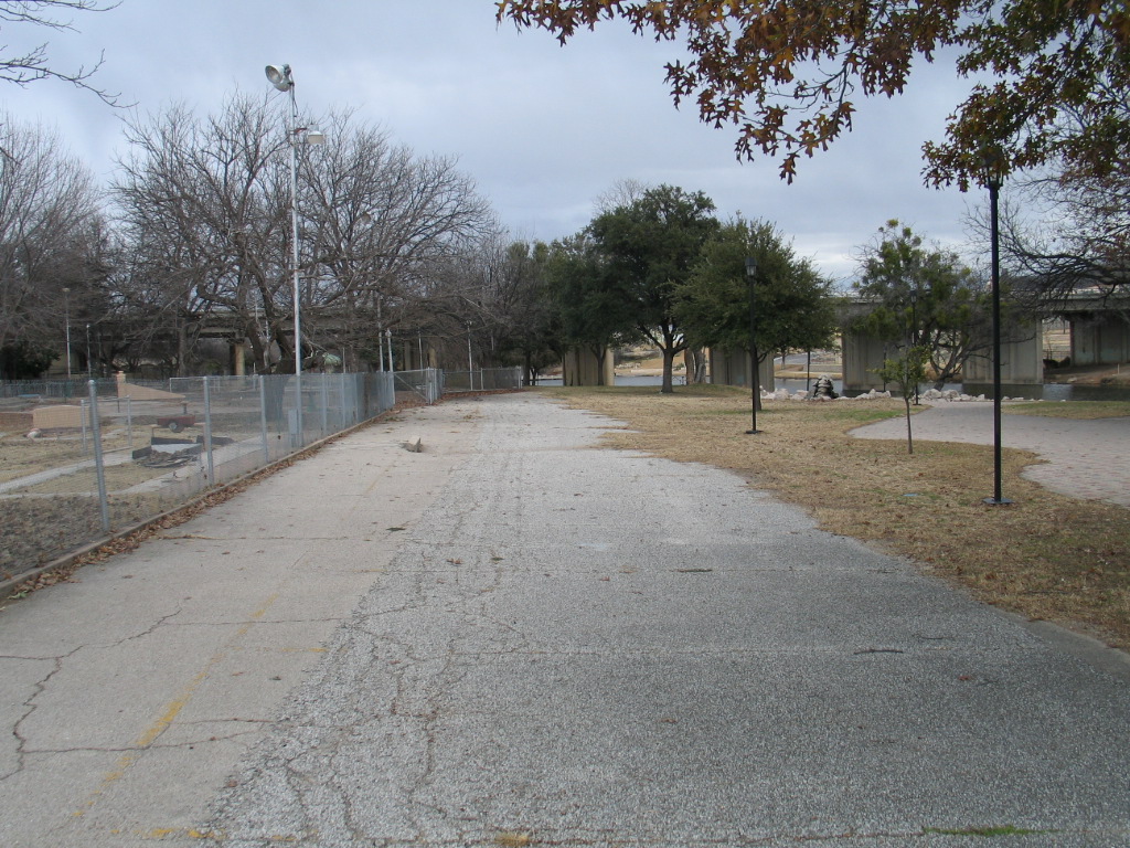
EXISTING PLAZA

EXISTING PLAZA

Reflections on a River, Part III, Thoughts:

With this crash-course underpinning (and having walked and biked our river trail for many years), we proceeded to learn and create.  Now, with the project built and embraced by the city, here are some reflections on the work:

1.       The project was a success because the work grew out of collaboration.  Citizens, City Staff, City Council, consultants, each individual in our office, contractors, stone masons, UCRA staff, and other subs all provided valuable input that we tried to heed.  Perhaps because we didn't know a great deal about landscape architecture at the beginning, we were able to listen more closely and follow good ideas no matter where they originated.  Many participated and have now taken ownership.  A good thing.

2.       Practicing good urban design was crucial:  Tying seamlessly into the existing fabric of City (streets, sidewalks, landscaping, plazas, etc.), using sequential vision to create a sense of discovery, accentuating landmarks, and focusing and fostering activity zones were all key in creating a larger coherent fabric, with each individual element adding to the whole.

3.        There was a lot to work with on an already beautiful river, even though much of what was built was tired...very tired.  By building on these existing qualities and buildings, by "going with the givens," it allowed us to cost-effectively enhance the  character of distinct areas.  For example:

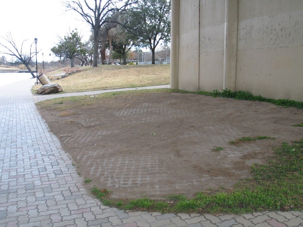
  • The "wasteland" areas below bridges were eroded and full of trash.  Yet, there was abundant shade and the temperature was noticeably cooler than adjacent sun-filled areas.  And so, we developed these shade zones as areas to put seating, exercise areas, artwork, etc.  They have become very popular on hot West Texas afternoons.
  • The river had areas with distinct characteristics.  And so, we were able to enhance these characteristics and create certain zones along a river trail: a Nature Zone, shade/shadow zones, a Cultural Zone, a Kid Play zone, and other future development zones, like pearls on a long necklace.  We simply built on what was already emerging.  I believe this is what Christopher Alexander calls "listening to a place."
THE BOSQUE

THE BOSQUE

COMPLETED PLAZA NEXT TO 87S BRIDGE - AT NIGHT

COMPLETED PLAZA NEXT TO 87S BRIDGE - AT NIGHT

Reflections on a River, Part IV, More Thoughts:

1.       We discovered that Landscape Architecture is not all that different from the architecture of buildings and places.  Good design seems to be a universal--whether it be buildings, landscapes, objects, or places--that can unlock potential.   This sounds very heady but during the design for the river, we became much more aware of simple elements such as plant types, xeriscaping, water use in a desert environment, hot/cool, shade/shadow/light, moving thru spaces, natural materials: we tried to use these as tools to create a sense of place...and sometimes of wonder, which seems to be at the heart of good landscape design.  Used well, these elements make a place where folks want to bring kids.  We are particularly fond of the large slab stones that were brought in to create a substantial and low maintenance pattern throughout the project.

2.       I'm glad the City insisted on longevity and low maintenance.  Too often architects design things that are beautiful...for a year or two.  And then the earth starts to reclaim what it lost, the beauty gets swallowed by time, and maintenance issues increase.   In light of this, everything we specified or designed was for the long term.  For example the LED lighting along the trails rarely needs maintenance, requires less energy, and lasts ten years or more.

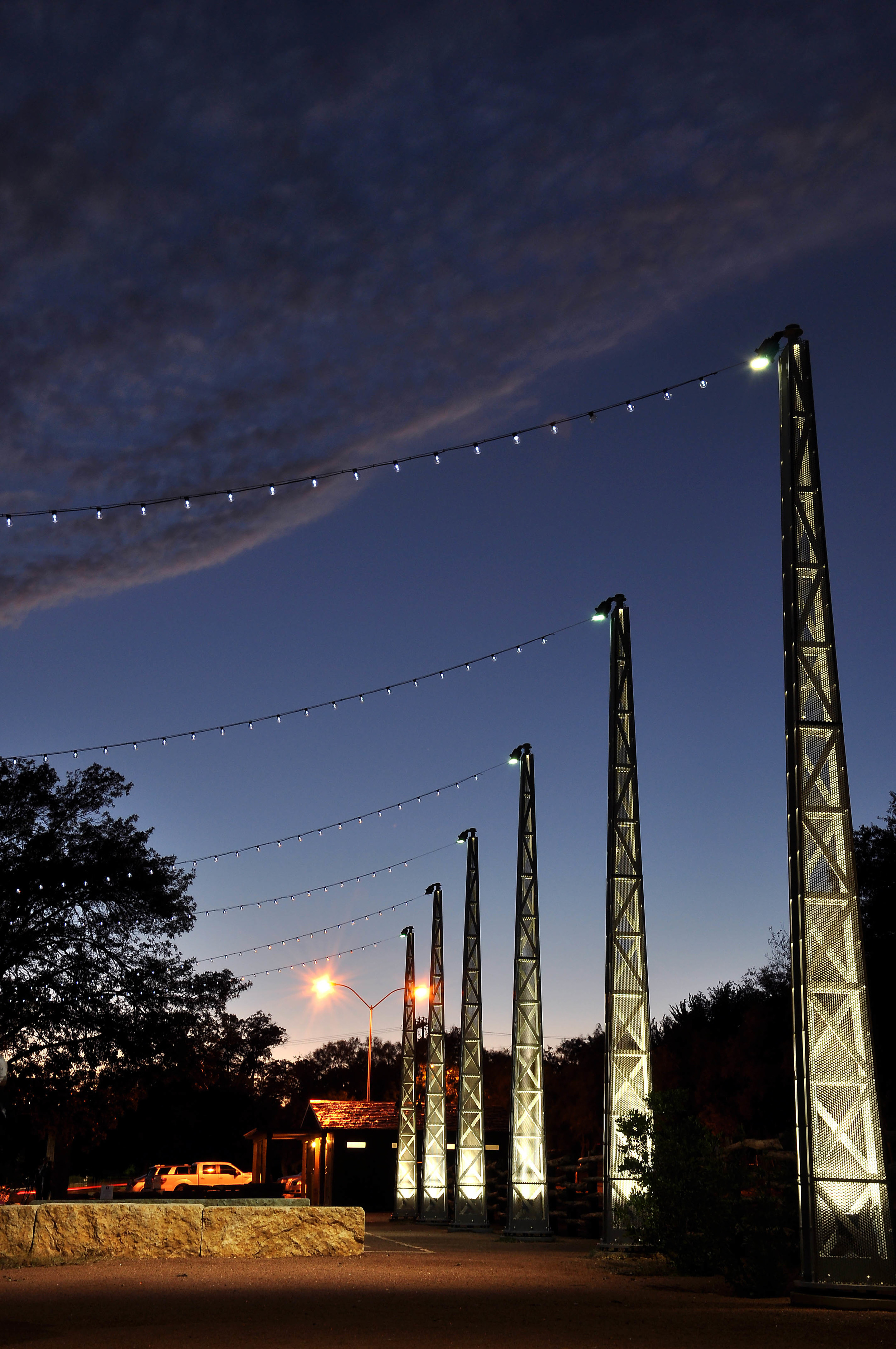
COMPLETED LIGHT TOWERS AT THE BOSQUE

COMPLETED LIGHT TOWERS AT THE BOSQUE

LED BRIDGE UPLIGHTING AT NIGHT

LED BRIDGE UPLIGHTING AT NIGHT

Reflections on a River, Part V, Even More Thoughts:

1.       We learned a lot about water quality from the Upper Colorado River Authority.  We visited the state of the art LCRA facility in Austin and traced where stormwater from the streets begins as black sludge and, after passing through several passive BMP's or filters, the water is purified and cleaned until it is clear as crystal.  We tried to adopt as many of these Best Management Practices as possible so that our river can begin to recover from years of neglect.  What is on the ground ends up in the river and the muck on the streets steals the oxygen from river water.  So we tried to slow stormwater down to prevent erosion and we filtered it slowly through open fields or Aqua Swirl tanks or bermed detention ponds so that it would lose impurities as it made its way to the river.    We studied ways to stabilize eroding riverbanks, arriving at rip rap as our best alternative due to costs and zero maintenance but also because rip rap boulders slow water down and creates habitat for aquatic life.

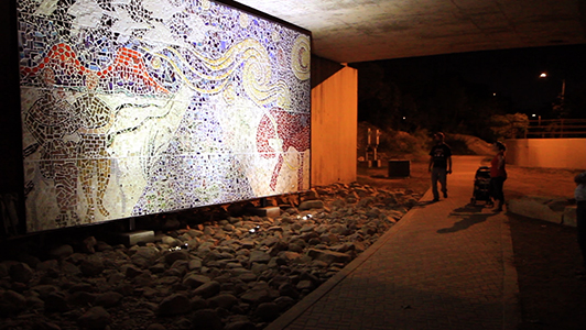
2.       There is a thriving art community in San Angelo.  Artists came forward to propose different art pieces for identified areas.  A sculptor was commissioned to create limestone panels of scenes depicting local flora and fauna.  Sixteen of these panels were set into a series of stone column  markers with uplit light cubes at the tops.  A series of mosaic pieces were installed in shaded areas below bridges:  mosaic cars/trucks and a fantastic fifteen foot by thirty foot large mural.  Overall, thirty new pieces were added to create a remarkable string of artwork along the trail.

When I first arrived in San Angelo twenty eight years ago, I remember jogging a broken pathway along the Concho River, amazed at the beauty and potential.  I remember seeing heron nests in trees and ducks landing on water.  Through the years, before the river project began, I biked often and slowly along the banks, getting a sense of the place, learning the history, patterns, the natural trails of wildlife, the smells, the hot/cool areas, shade/shadow/light at different times of the year, never imagining that we would be a part of revitalizing the heart of a fine city.  You never know.  I'm very thankful that our firm has had the opportunity to work on a project that brings such life.  We were pleased that the project won the statewide award from the Texas Recreation and Parks Society for Best Park of 2014.

FILTERING POND / FOUNTAIN

FILTERING POND / FOUNTAIN

MOSAIC MURAL ALONG RIVER TRAIL

MOSAIC MURAL ALONG RIVER TRAIL

Some Things We are Learning as We Design for Elder Care

My father--91 years old, one of the greatest of the Greatest Generation--had been failing for several years before he died last month.  Firsthand, I experienced his gradual decline and how the healthcare system he was in served him...or failed him.  Here are some observations of the care he received, along with some lessons learned as we visited the numerous facilities that my father was in:

1Experience matters.  Yes, our seniors can teach us--but that's not the type of experience I refer to.  Staff experience, training and , especially, a capacity for compassion were crucial.  During Dad's multiple hospital and nursing home stays, I observed the workers who attended to his needs.  On one end of the spectrum there were those who blustered into the room, waking my father for no apparent reason, not making eye contact, doing things to him but not seeing him.  Dad would glaze over on these occasions and his great humor would evaporate.  On the other end of the spectrum, I think of his last primary caretaker Sheku.  Sheku entered quietly, held my father's hand, asked him what he needed, gave gentle instructions of what he was doing or going to do.  They talked and began a real relationship.  Sheku was like a Zen master.  He saw my father, he had compassion.

Middle English, from Anglo-French or Late Latin; Anglo-French, from Late Latin compassion-, compassio, from compati to sympathize, from Latin com- + pati to bear, suffer with.

Of course most of the workers caring for my father fell somewhere between these two extremes.  Working with Baptist Retirement Community here in San Angelo, I have been impressed that they view training as the first good of great elder care.  They spend a lot of time with workers before they interact with elders.  The training they provide enables workers a much better perspective on the clients they serve...they begin to see them and serve them as a mission, not merely a method (I understand they have one of the lowest employee turnover rates in the country).  I'm not sure that compassion can be taught, at least not in a classroom setting...but it can be modeled, something I am witnessing daily.  Maybe compassion is contagious?

We can have the best facilities imaginable but if there are not compassionate and trained workers employed, what good does it do?

2.  Architecture matters.  As Winston Churchill puts it: "We make our buildings...and forever after, they make us."  The spaces that our elders inhabit make a real difference as life is lived out.  Small but basic things such as privacy (not having to share a bedroom, having a bathroom in your room), views to the natural world outside, natural light, eliminating as many "beeping devices" as possible, entering spaces that felt home-like rather than hospital-like all played a part in making my father comfortable.  I could see him relax or get agitated, depending on his environment.  In one Assisted Living facility where my father stayed, I remember walking out of his room to find a seemingly endless corridor filled with noisy machines of all types and with food carts loaded with different trays.  Workers reviewed charts to see what went where.  A nurse station sat at the end of the corridor, much like a guard station.  We can do better I thought.  We must do better.

Maybe hospitals have to be somewhat institutional to work properly.  Maybe.  Efficiency and cost-control are obviously important.  But when they dictate the architecture and the architecture then overshadows and crushes the spirit of the clients, what good is that?   As I research health care facilities of all types, I notice that things are moving towards a distinctly non-institutional and more home-like environment, even in hospitals.  Even large scale facilities can be broken into smaller, more intimate nodes.  Colors and finishes are more important than ever.  Natural light is crucial.  Assisted Living and Skilled Nursing facilities are really beginning to embrace this new model.  As an architect, I recognize that smaller scale and more intimate spaces cost more--we are continually seeking to balance costs with benefits.  This is a real struggle as we search for more humane and meaningful places.

3.  Options matter.  One of the hospitals where my father stayed had first-rate medical care...but not much else.  He stayed in his bed all day: unable to read, not interested in the reality tv or game shows on the television.  Nurses would come check vital signs and then move on to the adjacent room.  He was bored and I don't blame him.  Were it not for visitations from family and friends, it would have been disastrous.  On the other end of the spectrum, at one of the Skilled Nursing facilities where he stayed, there was an Event Coordinator who visited daily to make sure he knew of the ice cream social downstairs or the bingo event on the second floor, etc.  A physical therapist made scheduled visits and got him up walking several times a day.  These small calendar events were something to look forward to.  Dad got to choose which events he attended and his family got to be in on these decisions.  My father thrived in this setting which allowed him to heal from a fall much more quickly, which then allowed for a shorter stay in the facility--saving lots of money.  It seems pretty basic.

In the better facilities, other small choices could be made:  choice of small or large community room setting (rather than only one room or no community room at all), choice of large or smaller chairs along large windows or smaller windows, choice of various healthy menu options served on real plates.  Yes, these are small choices but they added up to a more humane way of living.  We all want to make choices.

In the not too distant future, we will be the ones who inhabit the health care spaces we (as a community) make--my hope is that the architecture of the spaces serves, ennobles, and inspires those in the final chapters of their lives.  My father trained combat fighter pilots during World War II.  I like to think of him up there in the skies in his AT-6, smiling, as he looks down on some good things happening in an often chaotic world.

Industrial Design: 5 Products We Like

Womb Chair – this classic design by Eero Saarinen is a favorite of ours because of its exposed hardware, classic aesthetic, totally padded surface, and comfort with multiple seating positions. The Womb Chair swallows you when you sit in it.

B.jpg
Red-Womb-Chair-Apartment-Therapy.jpg


Swissvoice L7 home phone- despite home phones being rapidly phased out by their cellular counterparts, we thought this one by Swissvoice had some very elegant lines and angles. Hard not to feel cool while talking into this thing.

03 Swissvoice L7 telephone £99.jpg
swissvoice_l7_home_phone_1.jpg

Nest Thermostat- this is an example of how design and technology can be applied to simple things in our life and have a large impact. The nest thermostat makes it easy to control the temperature of a house in an elegant, easy to use package without the confusion of a small, dimly lit LCD screen with vague, disassociated buttons and numbers. You simply twist the dial to scroll and push in/pull out to select and go back.  The smartphone connectivity is also a plus. 

nest_thermostat_iphone_app.jpg
nest-thermostat.jpg

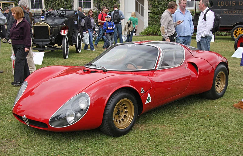
1967 Alfa Romeo Tipo 33 Stradale- this late 60’s Alfa designed by Franco Scaglione represents what we love about car design. It is lithe, fluid, beautiful, and almost looks as if the bodywork was poured over the chassis. Like most sports cars from the 60’s, it was plagued by quirks that made it a little difficult to use, but this is a prime example of an Automobile as art.

those flared fenders....

those flared fenders....

 I love how the windows wrap around the roof of the car

 I love how the windows wrap around the roof of the car

Toward Sofa- This is a newer design by Erik Jorgenson that evokes a distinctly midcentury-modern feel. We love how the cushions are different colors and sizes, yet they stick together as a family. The brass leg caps are also a nice detail. 

nice asymmetry.

nice asymmetry.

Toward_Sofa-Anne_Boysen_Erik_Joergensen-1.jpg

The Folks Who Build Things:

Below are brief descriptions of some of the craftsmen and subcontractors who are currently building certain projects that we have designed, each one adding a unique contribution, building on other voices and contributions.  Together, with us, with the engineers, with the client (and others), we hope to arrive at a special finished place everyone is proud of.  We all have a desire to do our best work and to take away the knowledge that we added something to the quality of life of those who will inhabit and use the spaces.  We believe this hints at the collaborative intent of our work.

Getting to know some of the subcontractors and tradesmen/craftsmen on our jobs has been a great privilege.  Sharing our worlds, learning about our respective families, discussing what really matters, all helps to foster a bit of community.  We begin building projects that may last nine months or even many years-a long time.  Why not engage?  Coincidentally, this helps to arrive at better projects and better construction.  Who wants to disappoint a friend?  It works both ways.  Caring about the other makes it easier to discuss problems or problem work.  It's hard to look each other in the eye if things are not going well.  Fridays in our office, we have begun to play a variation of chess we call Collaborative Chess...it's the same game but , instead of pitting one against the other in the traditional way, we have teams that speak to and help each other.  We make suggestions to the other team, we tell them that, if they move that piece there, then we will move this piece there--should they reconsider the move?  And so, what was once adversarial becomes a partnering paradigm.  Building is a complicated business.  It makes sense to engage the other as a partner.  There is enough adversarial stuff going on in the world, right?

kent.JPG

Kent:  Grew up in Snyder, Texas.  Worked for a construction company in Snyder, Texas until they went out of business.  Fortunately, Templeton Construction came to town to build a Walmart, he joined them (twenty six years ago), and has been with Templeton ever since.  He is a Project Superintendent overseeing jobs and he says that he loves what he does.  Best thing about the job: "it puts gas in his Harley."  Worst thing:  "dealing with those who don't take pride in their work or who try to take 'short cuts.' " Currently, Kent is the Project Superintendent for the YMCA Addition.

wade.JPG

Wade:  Born and raised in San Angelo, went to Central High School.  Has been with Templeton since 1992 doing carpentry work of all types.  Best thing about job: "pays his bills."  Worst thing (he says with a laugh): "has to wake up early each morning to get to work."  Currently, Wade is working on the YMCA Addition and the Kinney Franke Office Building..


steve.JPG

Steve:  Born in Paris, Texas but has lived in San Angelo most of his life.  Went to high school and then "the oilfield."  Has been in construction for nine years, working for Templeton.  Likes the Green Bay Packers.   Best thing about his job: Steve says that he enjoys all aspects of his work and the people around him.  Worst thing: "there are no worse things, it's all good."  Drives a Harley.  Currently, Steve is working on the YMCA Addition and the Kinney Franke Office Building.

snake.JPG

Snake:  Grew up in Lampasas, Texas.  Went to TSTI to learn the electrical trade.  Has been with Wesley Crow electric for twenty years.  Travels throughout Texas to different jobs.  Loves his work because every day brings something different.  Likes working on the River Revitalization because its outdoors.


brandon.JPG

McCrae Construction:  The McCrae family has been hard at work on the Concho river for a long time.  L.B. McCrae (father) went into business for himself in 1964 and built the original fountains that line the river in 1983.  Today, in our current 2012 River Revitalization project, these fountains are being "re-invented" by his sons.  Mickey is the current owner of McCrae Construction and Randy McCrae is the Project Manager.  Danny McCrae is the mason in the field (with his son-in-law Brandon and a nephew, Justin) interpreting the plans and doing some phenomenal work that transcends the drawings.  Their work has been particularly inventive and creative.  Danny says that the river project has been one of the best things he's worked on.  He enjoys seeing the continuation of the family history in the masonry work at the fountains...and he loves being outdoors.  The old and tired existing fountains look new and full of life.  Here are some before and after photos:

caleb.JPG

Caleb:  Grew up in a town near Waco, Texas.  Graduated from Angelo State University and went to work for Reece Albert in 2000.  Worked in the office for a few years, worked in the field for a few years and now manages projects around the state.  Absolutely loves the river project because its outside...and because its different than anything Reece Albert (typically, they do road construction) has ever done.  He says "there is a lot to learn here."

rex.JPG

 Rex:  Born and raised in Cairo, Georgia.  Worked for his dad in the construction industry before joining the Air Force, flying cargo planes all over the world.  Moved to San Angelo where his wife's family lived in the early seventies.  Rex has worked with Templeton for thirty two years doing all different types of work.  Is working as Project Superintendent on the River Revitalization project and enjoys the variety of the work...and being outdoors.  Also likes that there are fewer trades to coordinate.

Thomas.JPG

Thomas:  A native San Angeloan, Thomas was born into a family of craftsmen.  He has worked for various companies through the years and is currently with MidTex of Midland, working as the Superintendent for our Glenmore Elementary School Addition and Renovation.  Thomas is a master of the barbeque and has won several statewide competions for best in show.  We can verify that he is indeed gifted with barbeque...among other talents!

Monday, December 3, 2012 at 2:02PM

Thoughts on Building a New House, Part One

old house.JPG

Our family lived in a large fifties “ranchburger” style house (see photo on right) ; It was a nice place to live and raise a family, in a lovely neighborhood, with large oak trees arcing over the roof.  Problem was, after ten years, I had had enough.  The lovely trees and yard could only be seen thru small divided lite windows and the ceilings were low.  There was little connection to the outdoors.  I was claustrophobic.  Something had to go.  Likely it was Middle Age catching up with me but I felt I needed light and air.  I needed something.

In our established 1920’s era neighborhood were perhaps three lots that were clear and unbuilt.  The most beautiful of these—by far—was on Sulphur Draw.  It had a small creek running thru with trees lining the water’s edge.  Old timers told stories of exploring this area in the thirties.  Neighborhood kids had installed a rope swing in the deeper pool.  It had the feel of being in the country.  It was also considered unbuildable due to being in the flood plain. 

Washington Site.jpg

Here is a photo of the site, pre-house, from Google Earth My wife and I had talked for years about moving out of the ranchburger, so she was on board.  As an artist, she needed light and air also. We had been looking for years to find a different house in the same neighborhood—with no luck.

We made a list of For and Against the move to build a new house:

For:

pro con.jpg

1. Being an architect reduced architectural fees considerably

2. Having engineers donate their services for “a good cause” helped the budget.

3. Having good relationships with subcontractors allowed us to get some really good pricing

4. Having good relationships with local contractors allowed us to accept certain valuable materials that would otherwise have been discarded in the landfill (ie: select fill from ditches).  We needed a LOT of this to raise the house out of the flood plain.

5. Most importantly, we had/have a father in law who was/is a master builder…and who volunteered his time to build the house.  He is retired which allowed him the freedom to really spend time at the construction site.  Needless to say, this was invaluable and something that was crucial if we were to proceed.  Neither my wife nor I had the time to babysit a construction site.

expense of new home.jpg

Against:

1. Lack of funds.

2. Wanting to do something that would really connect to the outdoors and the site required something we didn’t have: funds

3. Not enough money.

“For” won.  In the end, no list was going to make the decision.  What was money?  This was emotional.  My wife called the number on the For Sale sign of the flood plain lot and worked the owner down to $25,000.  We were committed.

Tuesday, May 31, 2011 at 3:13PM


Thoughts on Building a New House, Part Two: Sustainability

What does it mean to be “sustainable” when you’re in the building business?  Isn’t that an oxymoron?  To build anything requires more “stuff” and energy.  Architects are trained to make things and things require energy and materials.  The most sustainable thing we could have done would have been to stay put in the ranchburger or renovate an existing house instead of building new. 

Clearly, we didn’t do the most sustainable thing.  But given that we were going to build we were committed to doing so with as little impact on the world as possible, as much as our budget would allow—not easy.  Though I am LEED accredited, I didn’t have the time or desire to do paperwork so we opted to simply do everything we could, within our budget, to “build green.”

Some primary goals we worked towards:

1. We researched energy efficient ways of building the shell: earth blocks, insulated concrete forms, straw bales, and structural insulated panels.  SIP’s won in the end due to the advertised ease of construction (not so, in our case) and because the factory is located two hours away (next door in West Texas).

2. An efficient, zoned, HVAC system.

3. Water saving features.

Some things we included in the house:

Kohlmeyer20House21.jpg

1. Across from our office (see photo at right), the two owners of a house built in 1901 were tearing it down themselves, board by board.  I asked if we might buy the lumber.  They were thrilled and so were we.  As I type this, I look down at our longleaf pine floor boards from the house (originally the shiplap interior siding in the rooms) that date back to the time of Jefferson and Washington.  I counted 223 rings on some of the boards—so I come up with 1779 as the date of the pine seedlings.  The floor is beautiful, dense, and lustrous not like the quickly grown wide grain pine wood of today. Not to say there wasn’t work involved in the reclaiming.  We planed and sawed and tongued and grooved.  Overall, it ended up costing about $9/sf.—pretty good

Additionally, the soffits above our patios came from the floor of the old house.  Glue from old carpet still stains them—we left all the “history” on them even though our workers begged to sand and finish them. 

old floors.jpg

Finally, we bought all of the old studs from the house. They were straight as an arrow and hard as nails.  All the lumber used in our house ended up being reclaimed.

2. We installed a white PVC roof (Durolast) that reflects the heat away in our desert like climate.

3. Installed a 10,000 gallon water cistern to catch rainwater off the roof.  This feeds our large grass lawn that leads down to the creek.  All other landscaping is xeriscaped.

008 Kinney House.jpg

4. We installed low water flow fixtures and used a continuous loop that circulates hot water to fixtures only when there is activity in the house.  This has been one of the things we like most: no wasted water waiting for a shower.

5. Installed insulated Low-E glass with thermally broken window mullions.

6. We carefully positioned windows so that they rarely receive direct sunlight and so that, during the day, we rarely turn a light on.

7. Used a high SEER rated air to air heat pump, zoned.  When the kids are at school, we turn their systems off.   During temperate months, we try not to use the system at all, using natural ventilation and ceiling fans.

8. We tried to minimize trips to the dump by creating a dumping ground of our own for discarded building materials.   Below the extensive fill used to create the slope up to the house we encouraged the tradesmen to dump scraps of lumber, stone, cmu, and other non-toxic materials.  This was the PHOTO donated fill saved from the dump.  The SIP panels, to their credit, had little waste due to their being built (to our design) in the factory.

IMG_0197.jpg

9. Lastly, we reused a great old fifties globe chandelier that was pulled from a dumpster—it used to hang in the local Junior High School Library and was thrown away(!) during a renovation.

Tuesday, May 31, 2011 at 3:11PM

Thoughts on Building a New House, Part Three: Site

What does it mean to “site” a building?  Aren’t the “Builder” houses on the west side of town “sited?”  Or the office buildings and strip centers along the street that lead to the west side of town?  What does it mean to have a “dialogue” with the physical environment?  That sounds very noble but it also sounds like academic “architectural-speak.”  Genuine dialogue is hard enough between people.

Yet, during this project, it became more clear that it is crucial to “listen to a site” and the only way to have a successful building.  And when I say site, my hunch is that Site is larger than merely the physical environment of land features and solar orientation.  It includes more abstract things such as Client, Budget, Program, and the Cultural/Social/Geographical meaning of a place.  Really, it is the thing that will help to create a PLACE—and places are where people want to be, isn't it?

Our site had the creek running thru, it had a small thicket along the creek, it was in the flood plain.  The best view faced East, toward the creek, a good thing for this site because the West sun in West Texas can make you cry.  For our small city, there is a fairly busy street along the south boundary.  It seems the stars had aligned for placing the house facing the creek, towards the best view, and out of harm’s way (the sun!).  The view was everything.  If the house didn’t pay more attention to the view than itself, I believe it would be a failure.  The entry and garage would be on the south where we would keep things simple with few windows to avoid a connection to the traffic of the street, as well as providing a buffer to the sun.  The south side could help to shield the rest of the site and house from noise and unwanted onlookers.

 -Tuesday, May 31, 2011 at 3:10PM

x 079.jpg

Thoughts on Building a New House, Part Four: Value

 Now, as I type, the sun sets in the west and we reap the benefit of seeing light reflect off the pond towards the east. The trees are lit, it seems, from within and it makes me glad that we said “yes” way back when.  This is a magical place or so it seems

Of course it came with a cost.  Before we said yes, we tried to estimate what a house like this might cost.  I drew plans and did my own cost estimate and then a local contractor friend did a separate estimate.  His estimate was more than mine.  And we chose to believe mine, fools that we were/are.  Don’t we always want to believe the best about the situations that affect us?  Surely it couldn’t be as bad as all that, right?  Wrong.  It ended up costing even more than my friend’s estimate.  As I witness the light as it sets and lights up the creek, and as I feel the breeze winding its way thru the house (windows open), I wonder what that might have cost, but not really.  It’s lovely.

Tuesday, May 31, 2011 at 3:09PM

Thoughts on Building a New House, Part Five: SIP's

As mentioned, we went with SIP panels for different reasons.  As advertised, the factory built panels (from approved shop drawings) would, in a sense, “snap” into place therefore greatly reducing labor costs.  Not so.  There was far less snap than anticipated.  Mostly it was a struggle to teach our local crew how to put them together and it became a painful and slow process of watching the shell take form.  Our guys knew stick-style framing but the panels were a different animal.  If the foundation is off by a quarter inch, the panels must be shaved just so in order to fit.  Running electrical thru the “pre-formed” conduit is not as easy as advertised, especially if there is anything unusual.  I suppose that, for a simpler tract house, the panels would make a lot of sense.  For us, I’m not sure we saved any money on the labor.

How have the panels performed? I was hoping they would end the hit that we take every month on energy bills.  They lessened the pain but they certainly didn’t end it.  Yet, I can’t say I’m disappointed because I don’t know what the bills might have been using other framing scenarios.  We have large expanses of glass opening to the view which can’t help the situation.  The bills are not nearly as high as our previous house (about $220 for electrical in August) but we don’t have the same square footage (now we have 2,400 sf vs. 3,200 sf previously).  Maybe my expectations were unrealistic. Maybe, if we hook up the solar panels we wired for, it will assuage my pain—the solar panels we couldn’t afford to begin with.

Since the panels were made in the factory and hauled here on a truck, there was very little waste—a good thing.

I will say that it is very nice to be comfortable in 15 degree weather outside.  The house is virtually airtight, it’s like living inside a Styrofoam beer cooler.  There are no radiant qualities here…but it only takes a second to condition the house and it stays that way for awhile unless you open a window or door.

SIPPanelsonTruck1.jpg

Thoughts on Building a New House, Part Six: Things I Wish I Had Done Differently

1. I would have spent more time researching “green” building systems.  I don’t dislike the SIP panels we used but they didn’t save labor as advertised.  They perform well now that we are in the house.  But they certainly didn’t snap together—maybe they do snap for spec houses, where the systems are more standardized.  Getting the electrical thru the “existing chases” was a challenge.

2. I would have spent more time trying to simplify the work process.  Most everything that we built had to be skimcoated, painted, re-worked, finished, modified, coddled, or cut-to-fit.  I’d like to do a house where, once an element is installed, that’s it, there’s nothing more to do: what you see is what you get and things actually do snap together.  This would take more up-front time with the design and with shop drawings.  It may be that I’m asking for too much, that the construction tolerances inherent in building will not accommodate such a vision…but if we’re not there yet, we’re getting close.  Machining and manufacturing, aided by new technology such as BIM should be close to achieving this end.  In a small town in West Texas, our local manufacturers are not yet there.  Modern architects in the twenties dreamed of such an architecture (eg: “a machine for living”) but the dream turned out to be difficult to realize on a budget…are finally getting there?

3. I would simplify the electrical switching.  We couldn’t afford to buy higher end automated lighting systems so we ended up with too many switches trying to do too many things.  There are too many circuits and dimmers and knobs and plates and you have to remember what is what or you’re likely to hit four switches before you get what you want.

 -Tuesday, May 31, 2011 at 3:06PM


Continuing The Bird Houses

The Bird house project continues. Here are all seven of our bird houses on display primed and ready to be painted. The bird houses are going to be set up at the back of our new offices, which is the old San Angelo bus station. We are going to paint the bird house in a monchromatic style with bright colors. We will have pictures up shorlty of the finished product

Wednesday, March 16, 2011 at 1:45PM

IMG_0298.JPG

From Greyhound Buses to Architect's Trusses

The old Greyhound bus station in downtown San Angelo is officially on its way to becoming Kinney Franke Architects' new home. It is exciting for us to be able to work in a space that was once a starting point--and ending point--for journeys. We'd like to think of the process of architecture as a sort of journey as well. In the photo below, you can see where travelers have left proof of their travels on a limestone window ledge.


new office 1.jpg

Construction has begun and the building has now been framed.

new office 2.JPG

 Working out the design has been great fun for our office. Some of our "Fun Fridays" have been spent drinking beer and trying to sketch how the space should work. Here are some of our goals:

  • Create an efficient and open layout, exposing the "bones" of the old space (specifically, the open web metal trusses). 
  • Cost effectiveness (of course!)
  • To create a dynamic anchor for the office (Conference Room) that is energizing, unique, and that encourages dialogue. 
  • Allow room for growth.
  • A sensible divide between our office and the retail space we have created at the front of the building. This retail space will hopefully be rented out by a chef with a vision in the near future.
  • Signage and parking that is easy for the public to locate and access.
  • And... a functioning kitchenette of course. 
new office 3.jpg

Another benefit of moving our office to this location is that we will be across the street from the lovely and historic Wendland building which has been transformed into an artist's studio. We caught a few of San Angelo's trademark sheep, waiting to be painted and peeping at us on our way out. 

new office 4.jpg

We'll keep posting updates on the progress of our new office. It's a great opportunity for us to create something good for our office and, hopefully, for downtown San Angelo.


 -Tuesday, March 6, 2012 at 1:25PM

new office 5.jpg

Fun Friday

 Last Fun Friday, Kye showed us all how to build a bird house like the boy scouts do! It was the first thing I have ever built and it turned out really well, with the help of Kye! I can't wait until next Friday when we paint them!

-Wednesday, February 9, 2011 at 4:51PM

IMAG5025.jpg

'The Used Car Lot' to Transition Once Again

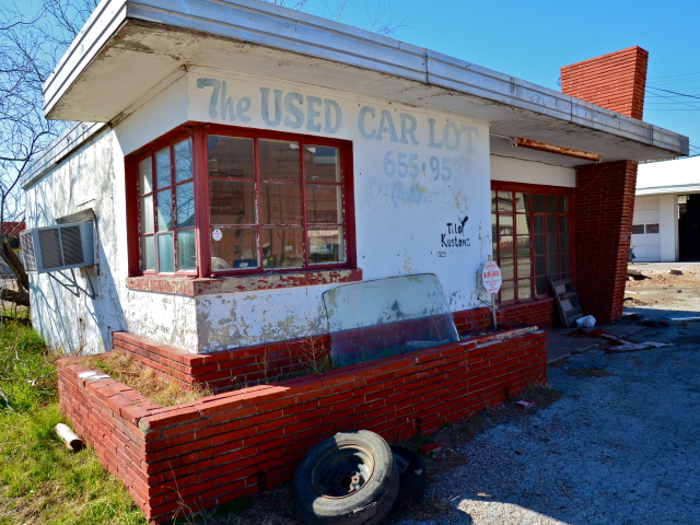
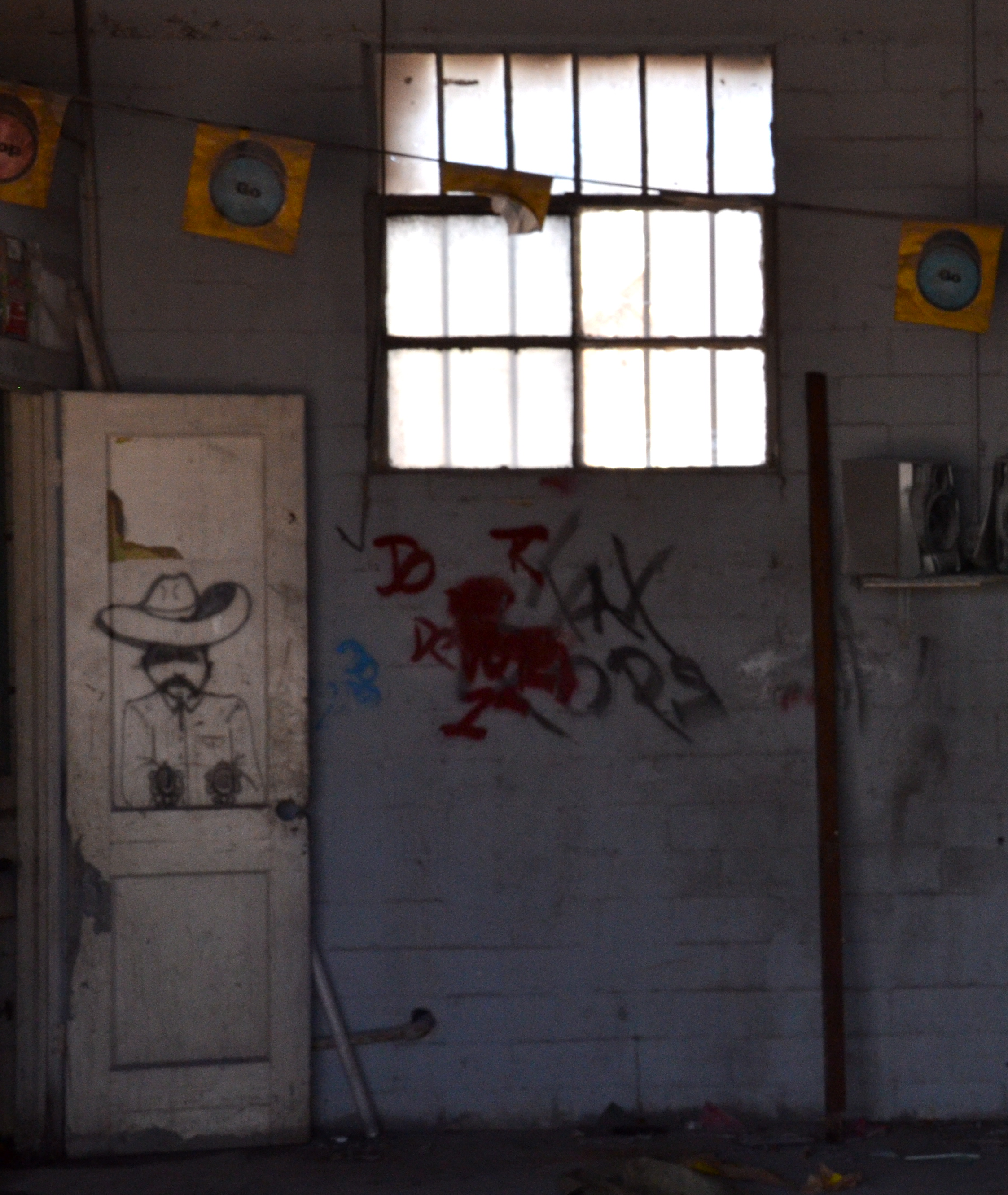
What once hosted many retail car operations such as 'The Used Car Lot', then 'Tito Kustoms', and then possibly 'Fat Pop's Shop' is now the future site for the San Angelo Area Foundation's new office building. There is something unique and almost humorous about the tiny, asymmetrical 50's shack plopped on the spacious corner lot of Concho and Irving St. downtown. It seldom gets noticed. Now it is about to be demolished to make room for the San Angelo Area Foundation. We wanted, however, to document what we believe is a vintage piece of architecture. 

used car lot 1.JPG

'The Used Car Lot' in all its vacant, rundown glory. The flat, straight lines in the building recall a bygone era...and echo the West Texas landscape. 

used car lot 2.jpg

There are still spare parts laying around. Anyone need a windshield replacement?

used car lot 3.jpg

The great, bold shapes give the building forward momentum. We are hoping to translate this momentum and sense of place into the new foundation offices. We intend to reuse the red roman brick in the new facade for the foundation.

The graffiti and paint jobs remaining gave us a taste of what the building's past lives may have been like. 

used car lot 4.jpg
Used car lot 6.jpg

We feel that it was important to document these buildings and the site so that they can help to inform what happens in the future. 

used car lot 5.jpg

From one life and generation to the next - such is the nature of buildings... and people! Much excitement comes from being able to be a part of these transitions as architects.  

Wednesday, February 15, 2012 at 12:24PM

This Is New.

This is new.  I have never “blogged” before

My architecture career was born when the computer was programmed using punched cards inserted into a large mainframe.  Computer Assisted Drafting was considered a novelty relegated to the Future.  REAL architecture was done by hand, laboriously and painfully, with mechanical lead pencils needing constant attention—you sharpened them by whirling them in a whirlygig device.  Neck muscles were sacrificed bending over drafting tables to reach details at the top of white vellum sheets.  It was considered ART.     

Now, our firm uses BIM software to produce Construction Documents.  There are two interns in our office that are wizards on Revit or most any other program that architects might use: Maxwell, Rhino, SketchUp, Photoshop, FormZ, InDesign, Illustrator, etc. etc. Pencils sit on our desks in cups.  Roll sketch paper is hidden in drawers, ready for the rainy day. 

This is not a nostalgic rant.  I don’t miss the pain in my neck or the graphite on my hands

The computer has eased the pain of so many tasks that seem oxen-like nowadays. So, here I sit typing into the Cloud or wherever it is that blogs like this live (where is that?).  This is a B-L-O-G.  Welcome to the world, as it is, say “yes.”

Wednesday, March 2, 2011 at 3:29PM

drafting.jpg